Orvala — Blog — Sales
Unit selectors: where buyers give up
Interactive unit selectors fail in a small number of predictable ways. Here are the ones we see most, and what to do instead.
An interactive unit selector should shorten the path from interest to enquiry. Plenty of them lengthen it. The failures repeat, and they are all fixable.
The list and the building disagree
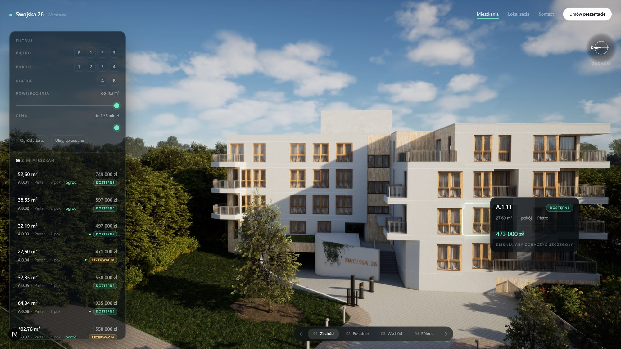
A buyer filters to three-bedroom apartments, then clicks a unit on the building that is not in the filtered set. Now they do not know whether the filter is broken or the building is.
The list and the model have to be one selection state. Filtering should dim what no longer matches rather than leaving it fully live, so what is left reads as the answer.
Hover reveals nothing useful
Hovering a unit and getting only its code is a wasted interaction. Area, rooms, floor and price should appear before the buyer has committed to a click, because that is what lets them scan a facade quickly instead of opening eleven pages.
There is no way back
A buyer opens a unit, decides against it, and finds no obvious way back to what they were looking at. If the browser back button does not work, the selector is not a website and people will treat it as broken.
Every state that matters — a selected unit, an applied filter — should be in the URL.
If a buyer cannot send the exact apartment to their partner as a link, they will send a screenshot, and you will never know it happened.
Sold units disappear
Hiding sold units feels tidy. It removes your strongest social proof and makes an active development look small.
Show them, mark them clearly, and make them unclickable. Scarcity works, but only when it is visible.
It only works on a desktop
A large share of first contact happens on a phone, frequently on the way to or from a viewing. If the selector needs a mouse hover to reveal anything, it does not work for those people at all.
Touch needs its own path: tap to select, panel slides in, tap outside to dismiss. Not a hover interaction with the hover removed.
The load is the first impression
A selector that takes eight seconds to appear has already lost a share of its audience, and the people who leave are disproportionately the ones on weak connections — often the ones standing in your sales gallery.
Something meaningful should be on screen in under two seconds, even if the full experience arrives behind it.
Book a call
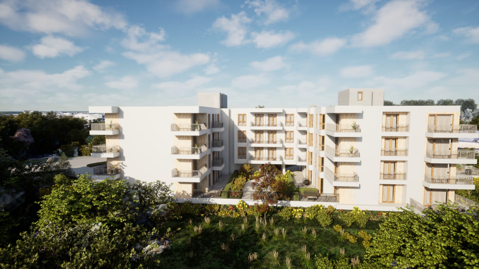
See your own building running like this.
Send us the development — units, floors, and whatever drawings or model you already have. We come back with what it would look like, what it would cost, and how long it would take.